ShopDreamUp AI ArtDreamUp
Deviation Actions
Suggested Deviants
Suggested Collections
You Might Like…
Description
Happy birthday Bekkah!!!
A.K.A. ~x0rainyday0x
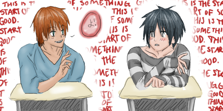
These are two of her characters, Key (on the right) and Kit, (on the left). They're supposed to be meeting o:
Key is pretty shy around people he doesn't know, I think... so that's why he's all... -uke face- It's his first day (as a sophomore maybe?) in a new high school so he's also kinda nervous. But he really just wants to have fun.
And Kit isn't really shy or outgoing but he... liked Key's shirt...? Lol, so he said, "yo!" Which is what the Japanese says.
Just for the record, I made this all up so it's subject to change upon my lovely Asian's request! (yes she is my Asian)
I got lazy with the desks, plus I didn't want to draw awkward!crotches, so I scribbled. =w=;;
The words in the back say "this is the start of something good" over and over.
Oh, and this IS NOT YAOI. ='D So don't be like, "they're so cute together!" (unless you're Bekkah and then that's okay lol) or anything. |3 They have an open friendship but this is not supposed to be hinting at anything.
This doubles as my #1 entry for the 100 themes challenge, "Introduction" B)
Image size
900x450px 504.47 KB
© 2008 - 2024 Misshy
Comments32
Join the community to add your comment. Already a deviant? Log In
I'd like to see you do something stronger that you're going to spend time on - easier to push you a bit with these crits  . This one is calling out as "sketch!" still with lines that are really unfinished. If you're going to do lineart, go all the way for us, gonna do colors? tighten up on the edges. Really show us what you're made of here.
Color wise I'm thinking that you're airbrushy colors are doing more harm than good on this piece. I'd like to see some sharper transitions on something like this, the softness just isn't very eye catching. Also, avoid white! Go for off tones of white if you can, like a lighter grey/blue. Pure white or black distort the areas around them a bit, and can be very visually dominant.
Hair is pretty good here, and general layout isn't bad - horizontal isn't horribly enjoyable usually, but given the subject, there's not much to do dynamic wise, so it works.
I was told very recently something that I'm going to hold with me for awhile: "The moment something works well and is under control - is the time to give it up and try something else." The moment you feel yourself getting complacent or lazy on something - push yourself to extend a bit further - even if a tiny bit. It will keep your skills building constructively, even if it does pull you out of a comfort zone. Comfort zones weren't made for art


